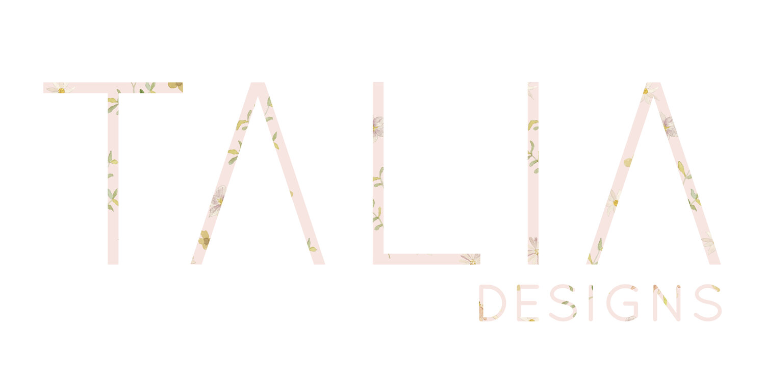
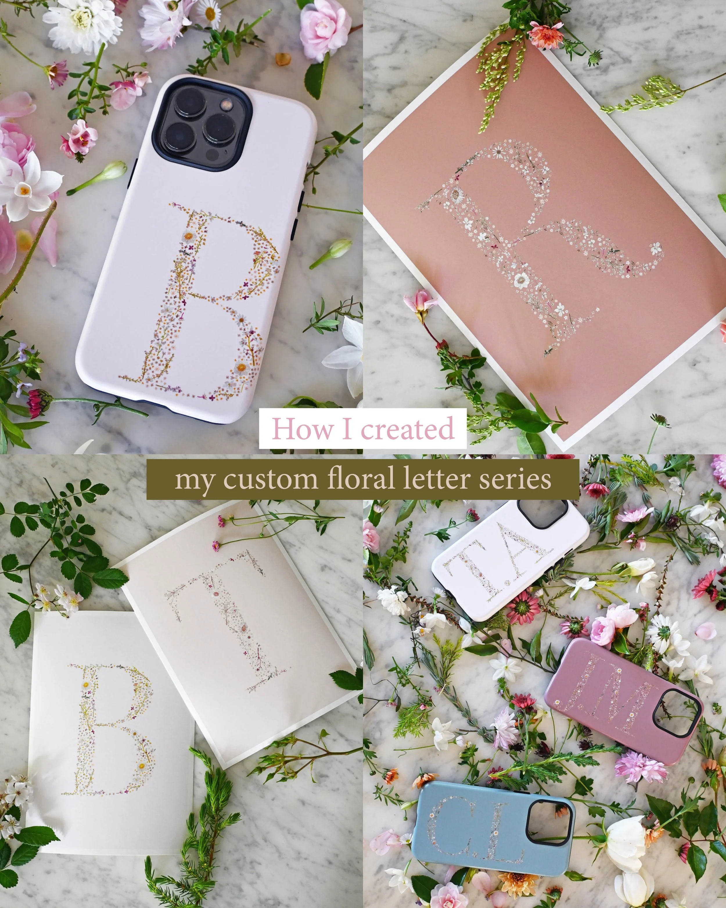
How I Created My Custom Floral Letter Series (From Hand-Painted Flowers to Personalised Art)
There’s something so special about creating something that feels personal — a piece of art that’s tied to a name, a moment, or someone you love.
My custom floral letter series began with a simple idea: to form each letter from hundreds of tiny, hand-painted flowers and leaves, bringing together all the softness and detail I love most about nature.
What started as an experiment quickly became one of my most meaningful collections — a way to turn something as simple as an initial into a piece of art that feels thoughtful, delicate and completely unique.
Where the Idea Began
I have always been drawn to the tiny details of flowers.
While larger blooms like roses tend to stand out in gardens, I’ve always found myself noticing the smaller ones — the delicate, often overlooked flowers, tucked between leaves and stems. The tiny ones that can often be forgotten, that you have to slow down to see and really hunt for them.
That subtle beauty, combined with my love of being outdoors and surrounded by nature, made me want to capture a soft, cottage garden feeling in a completely different way.
I began wondering what it might look like to bring that feeling into typography — to create letters that felt organic, detailed and crafted from flowers, rather than structured or predictable. A letter brought to life by hundreds of those tiny blooms.
I hoped for something more meaningful than a standard monogram. Something that felt like a piece of art in itself.
And that’s where the idea for my floral letter series began. 🌸
Painting the Individual Elements
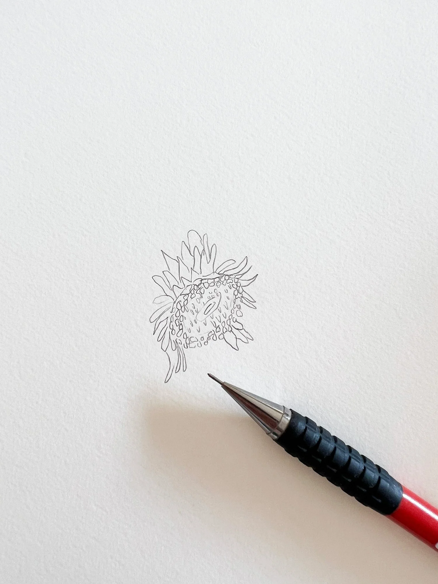
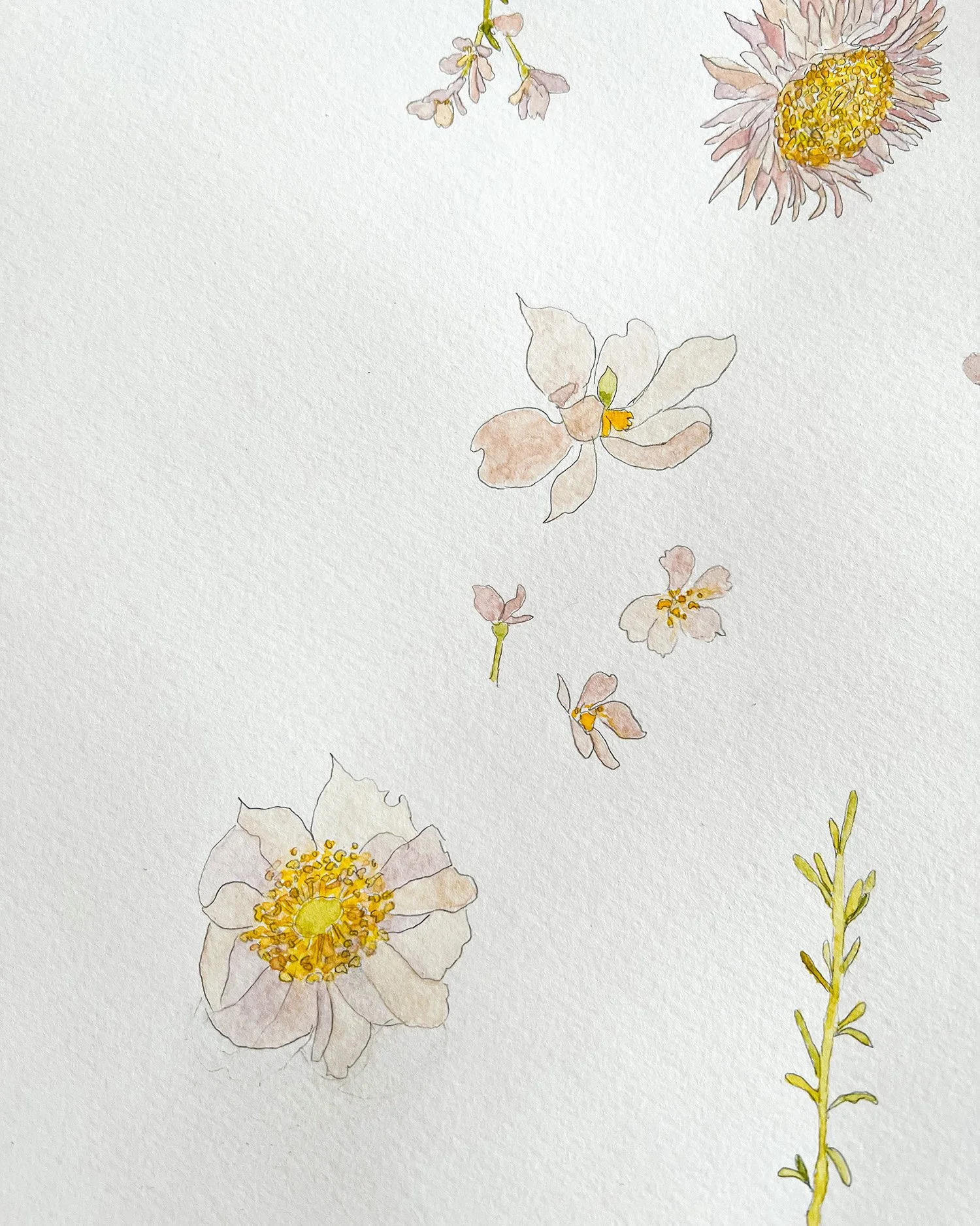
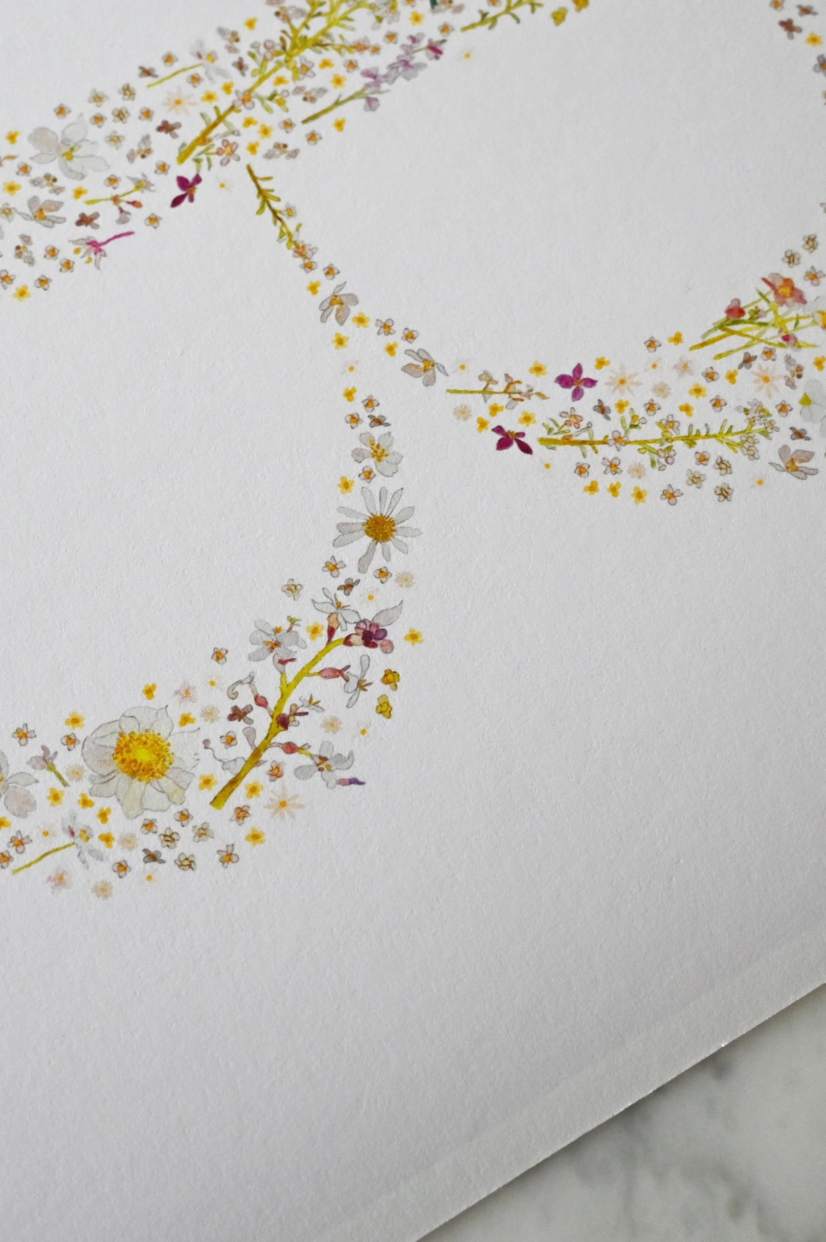
Each letter begins with the smallest details.
I hand paint every flower and leaf motif in watercolour, focusing on capturing that soft, natural variation you find in nature.
Many of these elements are inspired by flowers I’ve seen in gardens I’ve visited, as well as little blooms I’ve picked from my own garden and brought into my studio. There’s something special about working from real flowers — observing the way they curve, the way colours shift so subtly within each petal.
Once painted, each piece is carefully photographed and transformed into digital elements, allowing me to bring them together in new ways while still preserving the texture and softness of the original artwork.
It’s a slow, detailed process — but it’s what gives each letter its depth and that gentle, organic feel.
Building the Letterforms
Once I had created a selection of beautiful hand-painted motifs, I could begin forming the letters themselves.
I chose an elegant serif font as a starting point — something classic and timeless — and used it as a guide for each letter shape. From there, I began the slow process of building each letter in Adobe Illustrator, carefully placing hundreds of tiny flowers, leaves and stems one by one.
Each placement is deliberate. I consider the balance, spacing and flow of every element, allowing the composition to feel soft and natural rather than rigid or overly structured — like a rambling cottage garden, with flowers overflowing onto the cobblestone path.
The letters were created with the law of closure in mind — even though there are no solid outlines, your eye naturally connects the scattered florals to recognise the form of each letter. The flowers themselves become the structure.
It’s this process that gives the letters their delicate, airy quality — as though they’ve gently formed on their own, like wildflowers growing into shape. I will admit, creating all 26 letters did test my patience, but it was worth every painstaking flower placement.
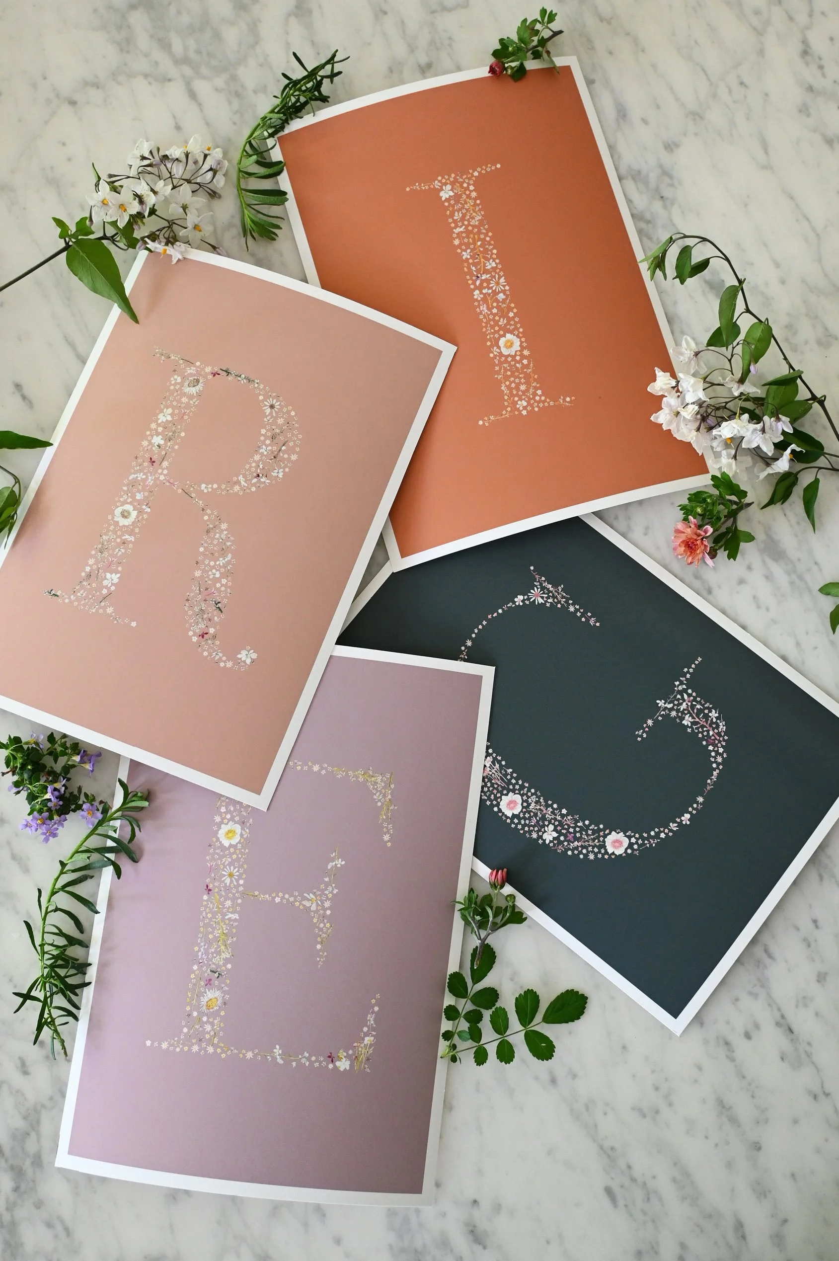
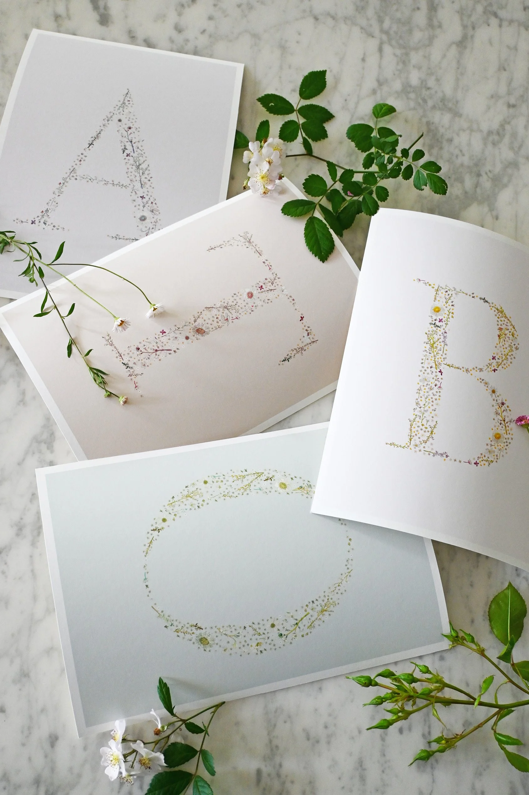
Creating Different Colourways
Once the letters were formed, I began experimenting with different colourways to explore how each piece could feel slightly different.
I worked with a range of background tones, from soft blush pinks to earthy greens and deeper rust hues, to create subtle variations across the collection.
It was interesting to see how much the feeling of each letter could change through colour alone — some becoming softer and more romantic, others a little more grounded and earthy.
I wanted to create a range of options that felt cohesive, yet varied enough for people to find something that truly resonated with them — whether that’s something light and delicate, or something with a little more depth and warmth. 🌸
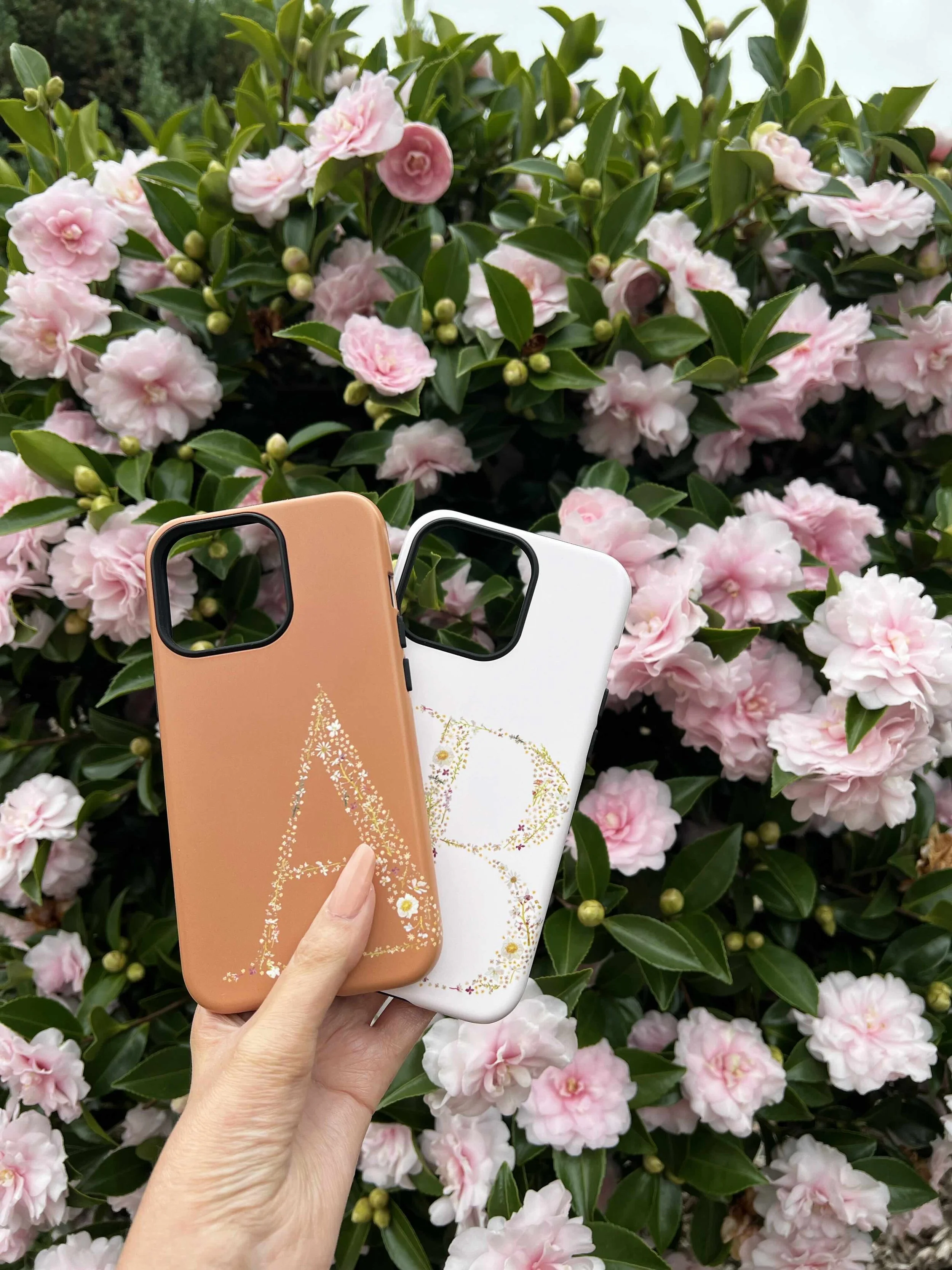
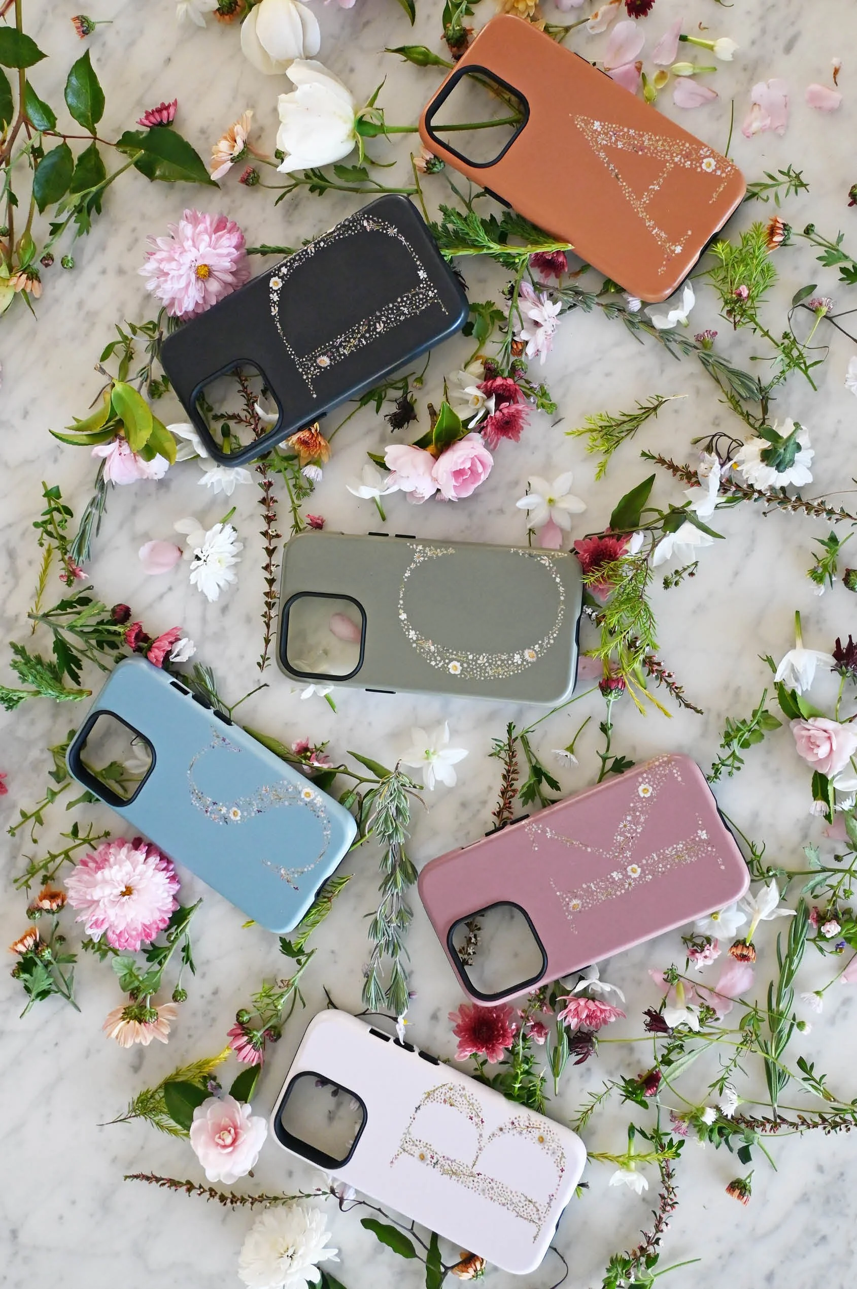
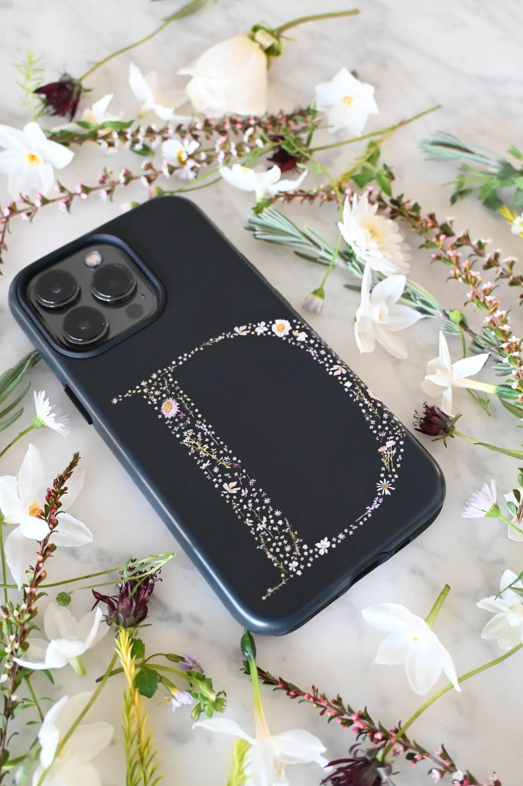
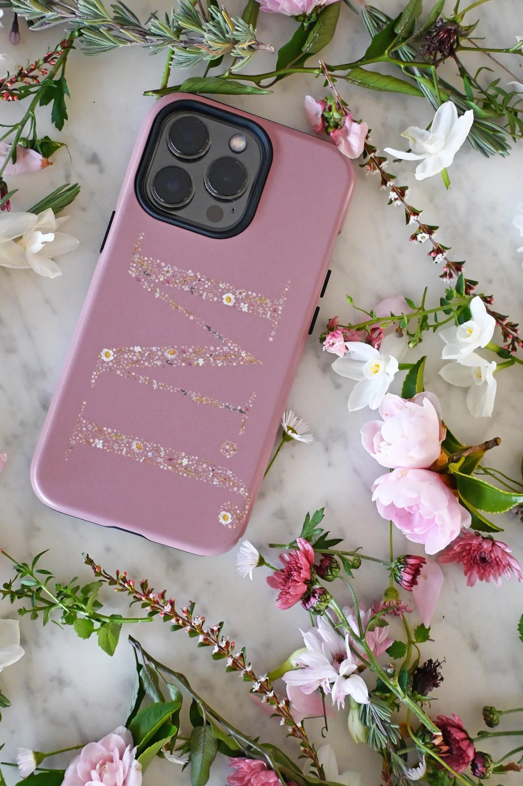
Personalised Phone Cases
I’ll admit, I felt a little nervous when I first released these letters as personalised phone cases.
They were so detailed and personal to me, and I wasn’t sure how they would translate into something people would use every day. But almost instantly, they became one of my most loved designs.
There’s something special about being able to personalise your phone case — choosing your own initial, your own colour, and turning something practical into something that feels entirely your own.
I created both single initial and double initial designs, allowing for a little more flexibility — whether it’s your own letter, a shared set of initials, or something meaningful to you.
What I love most is seeing these pieces move beyond the artwork itself, becoming part of someone’s everyday life. A small piece of art, carried with you wherever you go. 🌿
From Small Details to Larger Works of Art
But there was something quietly niggling in the back of my mind.
While I loved seeing the letters come to life on phone cases, they are, by nature, quite small. And although they looked beautiful, I couldn’t help but feel that some of the finer details — the tiny brushstrokes, the subtle colour variations — weren’t always fully appreciated.
So much time had gone into creating these letters as intricate works of art.
And I began to think… maybe they should exist in that format too.
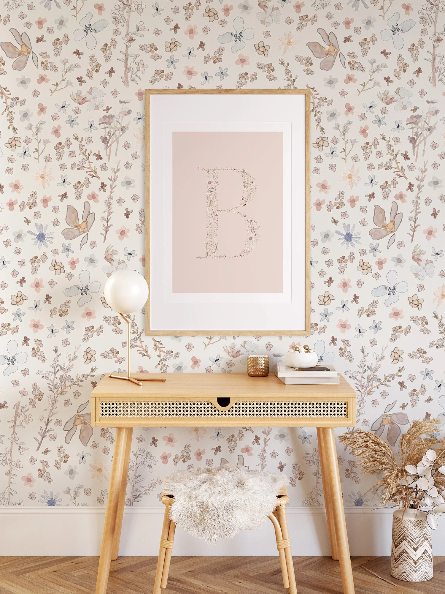
That’s when I decided to release them as fine art prints.
For this collection, I explored entirely new colourways, using Photoshop to gently transform not just the backgrounds, but the tones within the flowers themselves. I created a series of soft pastels, alongside brighter, more vibrant options — each one designed to feel cohesive, yet distinct.
With an emphasis on timeless nursery art, these pieces were created to feel both meaningful and enduring — heirloom-style monogram prints that can grow with a space over time.
Printed on cotton rag paper, they hold onto all the softness and detail of the original floral illustrations, allowing each tiny flower to be seen and appreciated as it was intended. 🌸
PERSONAL MEANING
It has been such a joy to create these personalised pieces for you all.
They hold a meaning that goes beyond the object itself — whether it’s your own initial, a child’s name, or a combination of letters that represent someone you love.
What I love most about these floral letters is that they feel both personal and timeless. They aren’t tied to a trend or a moment, but instead become something that can stay with you — evolving as your space or life changes around them.
It’s a simple idea, but one that feels deeply considered. A small piece of art, created just for you. 🌿
CONCLUSION
This series has been one of the most meaningful to create.
From painting each tiny flower, to carefully building every letter, and finally seeing them become part of people’s homes and everyday lives — it’s been a process grounded in detail, patience and a love of nature.
What began as a simple idea has grown into something much more — a collection of pieces that are not only beautiful, but personal, and made to be kept.
And that, to me, is what makes them so special. 🌸