Neutral Phone Case Aesthetic Ideas (Delicate Hand-Painted Floral Patterns)
Neutral phone cases have become increasingly popular over the past few years — and it’s easy to see why.
Soft, understated colour palettes tend to feel timeless. They pair effortlessly with almost everything, feel calming to look at throughout the day, and bring a more refined, elevated feel to everyday accessories.
But neutral doesn’t have to mean plain.
Some of the most beautiful neutral phone case designs are the ones that combine soft tones with delicate artistic detail — subtle florals, painterly textures, muted botanical elements, and dainty hand-painted patterns inspired by nature.
As an artist, I’ve always been drawn to softer palettes and organic details when designing my floral phone case collections. Many of my designs are inspired by wildflowers, cottage gardens, vintage botanical illustration, and tiny hand-painted floral motifs scattered gently across the surface of the case.
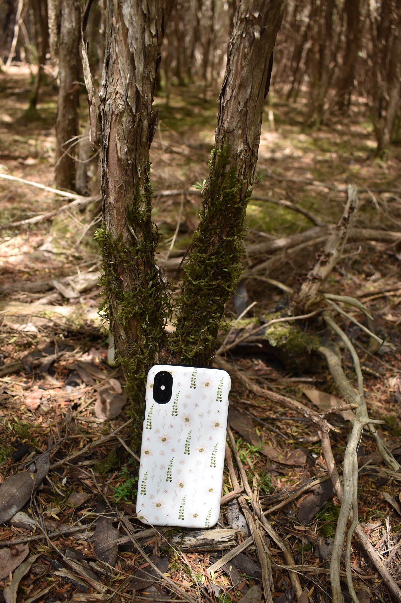
The subtle hues found in nature — from the gentle yellow-greens of grass to the pastel shades of wildflowers — are always inspiring my designs. I find dainty, delicate flowers work beautifully with neutral tones, almost as though these phone cases could belong in a forest and blend in naturally, as if they had always been there, growing quietly amongst the bush.
If you love elegant, feminine accessories that still feel timeless and versatile, here are some of my favourite neutral phone case aesthetic ideas with a floral twist.
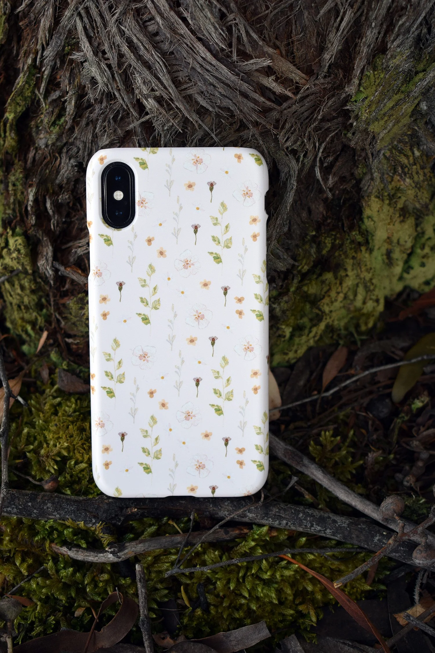
✿Yara — Soft Wildflower Neutrals
Yara features delicate wildflowers scattered across a soft peach background, creating a look that feels airy, understated, and effortlessly feminine.
The muted botanical tones make it an easy everyday neutral, while the tiny floral details give the case a gentle cottage-inspired feel without overwhelming the design.
It’s perfect for those who love:
soft neutral aesthetics
subtle floral patterns
minimalist feminine style
forest fairy vibes
delicate nature-inspired artwork
✿Theo — Soft Lilac Floral Minimalism
Theo combines soft blush florals with tiny botanical details in a way that feels elegant and refined.
The scattered floral layout is set against a subtle mauve background and gives the design plenty of breathing room, helping it maintain a lighter, more minimalist appearance while still feeling artistic and romantic.
This style works beautifully for anyone drawn to:
mauve neutral tones
soft feminine aesthetics
floral minimalism
wildflower vibes
understated floral accessories
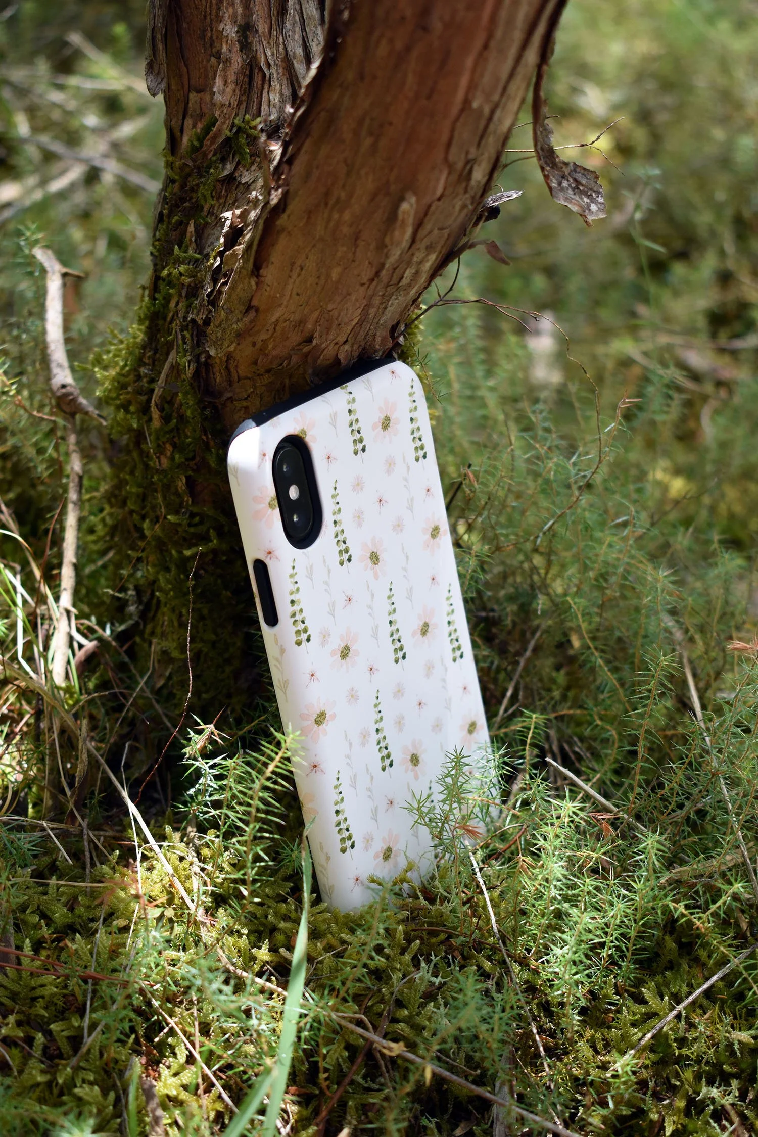
✿Oakley — Earthy Botanical Neutrals
Oakley leans slightly more earthy and botanical, with muted sage greens and soft floral detailing set against a pale blue background so soft it almost looks white. Inspired by wild meadow landscapes and daisies, this phone case feels ever so sweet.
The subtle green tones help bring warmth and depth to the design while still maintaining a soft pastel feel.
For those who prefer more nature-inspired neutrals, Oakley offers a soft botanical aesthetic that feels calm, organic, and timeless.
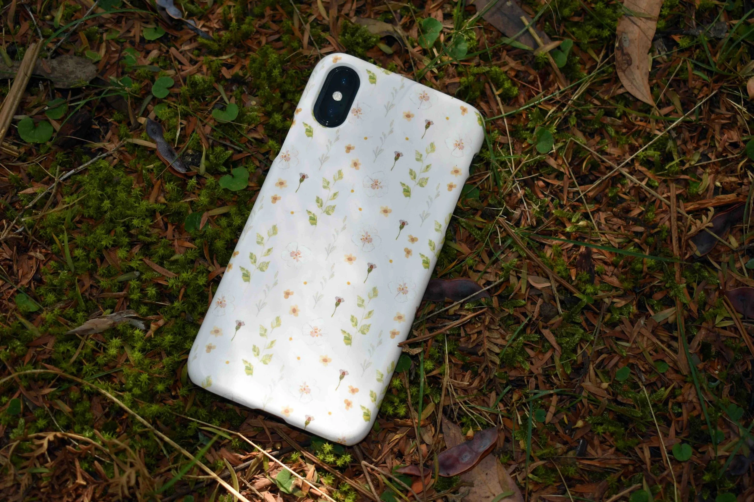
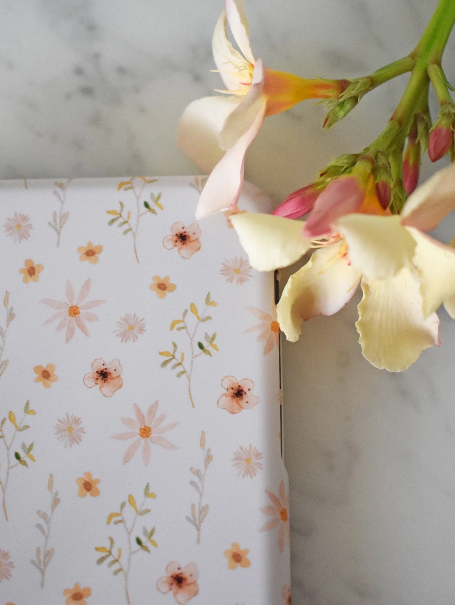
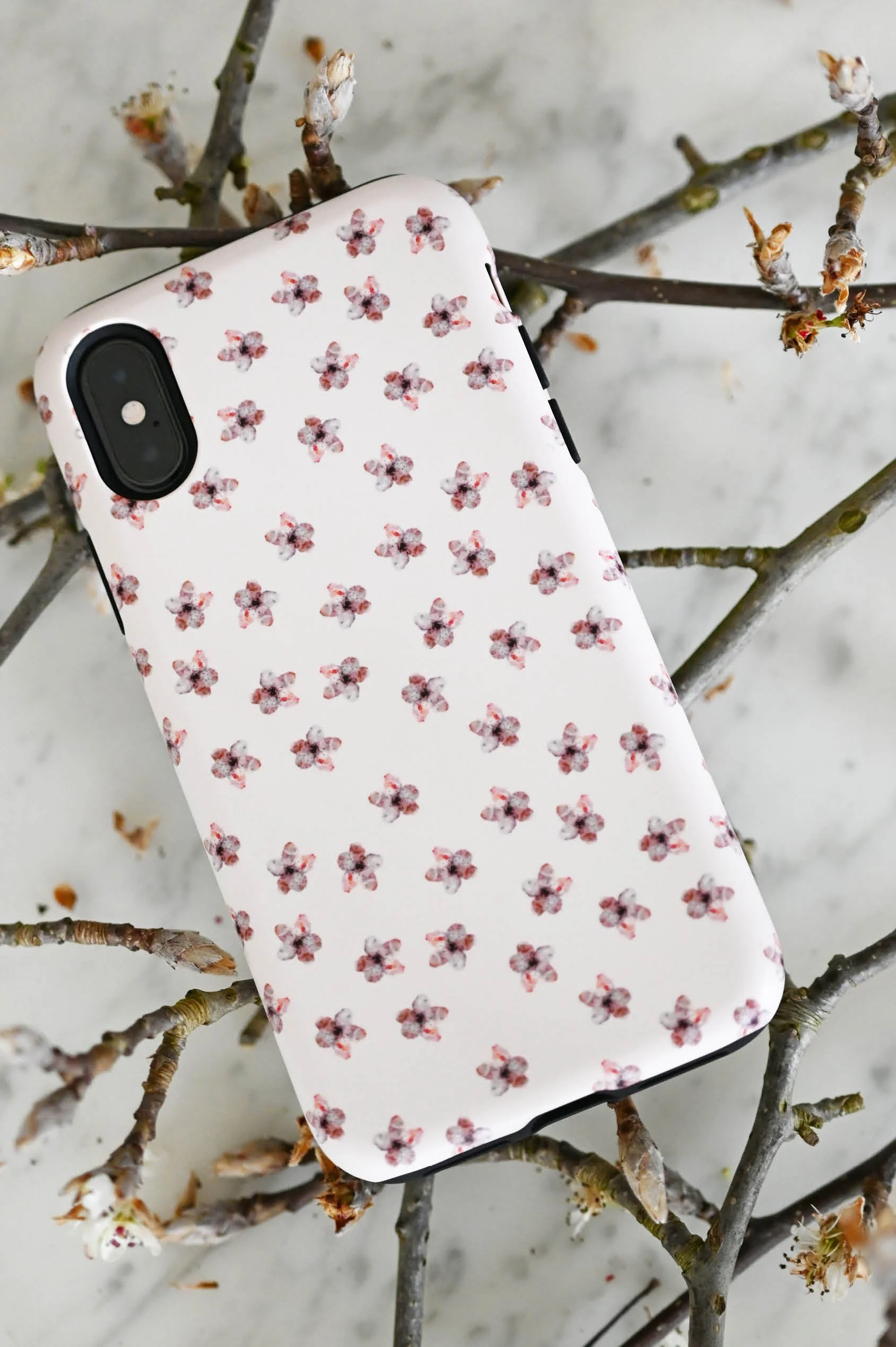
✿Briony — Tiny Floral Details on Soft CREAM
Briony features one of my favourite styles of pattern design — tiny repeated florals scattered gently across a soft neutral background.
The small-scale floral pattern gives the case a delicate feel, almost reminiscent of vintage fabric prints or hand-painted floral stationery. With touches of forest green and earthy sage, Briony feels as though she belongs in a forest.
Because the colours remain muted and understated, the overall design still feels minimal and versatile despite the intricate detailing. The tones don’t overwhelm, but instead work harmoniously together.
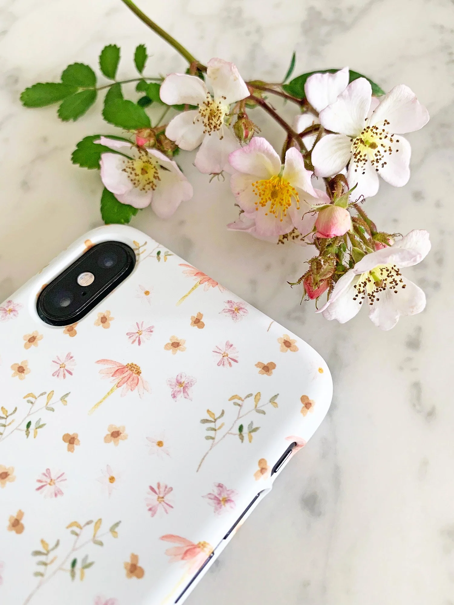
✿Mia — Painterly Florals in Soft Neutral Tones
Mia combines soft blush tones with delicate painterly flowers for a romantic neutral aesthetic.
The floral elements feel airy and organic, helping the design maintain a soft, elegant appearance rather than feeling overly bright or bold. A single flower is repeated throughout the pattern, giving the design a more minimal feel.
This style is perfect if you love:
feminine neutral aesthetics
soft pink and cream palettes
artistic floral accessories
timeless romantic details
Why Neutral Phone Cases Feel So Timeless
One of the reasons neutral phone cases remain so popular is because they tend to age beautifully stylistically.
Soft creams, warm blush tones, muted greens, and subtle botanical details often feel less trend-driven than brighter statement designs. They also pair effortlessly with a wide range of personal styles, outfits, bags, and everyday accessories.
Neutral designs can still feel expressive and artistic — especially when combined with delicate floral illustration and hand-painted detail — while remaining versatile enough for everyday use.
There’s something calming about softer palettes and understated artwork that makes these designs feel timeless season after season.
Neutral Doesn’t Have to Mean Boring
Neutral phone cases don’t need to feel plain or overly minimal.
The most beautiful neutral designs often combine softness, artistry, and subtle detail in a way that still feels personal and expressive.
Whether you gravitate towards tiny hand-painted wildflowers, muted botanical patterns, soft blush florals, or earthy sage tones, neutral phone cases can still feel full of warmth, creativity, and personality — while remaining elegant enough to go with everything.